ABOUT COMPANY:
A non-profit Saudi professional organization driven by a wealth of local, regional, and global expertise. Our mission is to excel and advance the field of project management, both locally and on a global scale. Our primary goal is to elevate the profession while bridging the divide between international best practices and the unique experiences and approaches found in our local and regional contexts.
THE SYMBOL:
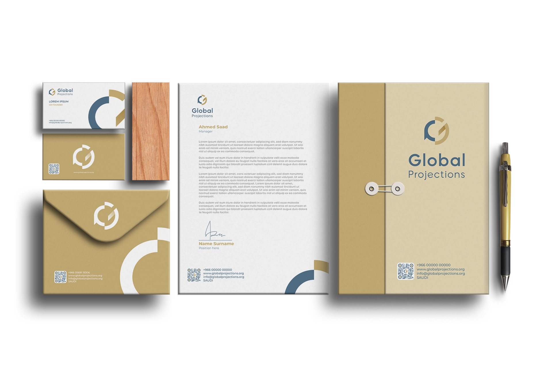
The logo design was a result of merging the letters G and P from the company's name "Global Projections" along with elements representing global outreach and messaging. This creative amalgamation symbolized communication between the company and its worldwide clientele, ultimately resulting in the completed logo design.
TYPOGRAPHY AND COLORS:
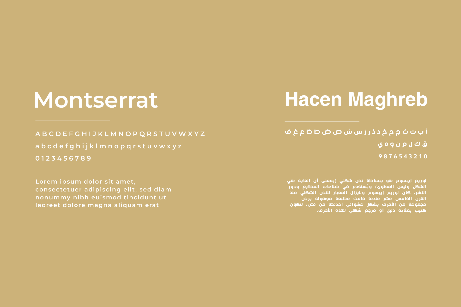
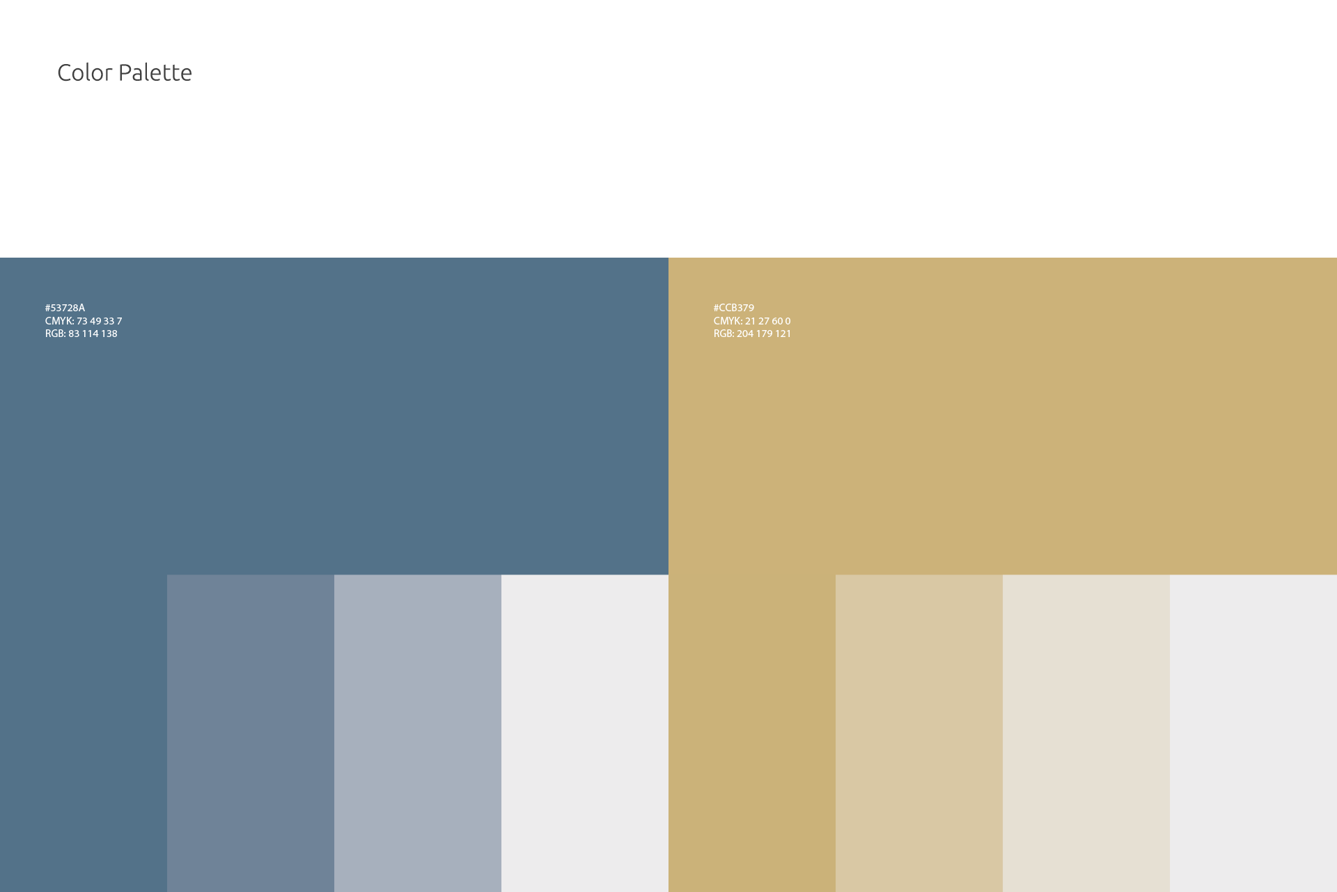
The typography selected for the visual identity serves to enhance the brand's qualities. It is robust, geometric, easily legible, and adaptable. The color palette revolves around shades of Sky Blue, and Light Goldenrod, imbuing the entire visual identity with sophistication and contemporary flair. Sky Blue takes on a prominent role, exuding seriousness, equili rium, maturity, and a sense of security. Its external facet signifies security for clients and partners an assurance of punctuality in deliveries and steadfast dedication to projects.


